
Lean UX & Prototyping for IOT
- what we did:
- We ran a lean UX & design doing workshop with the IOT team which resulted in the build of an MVP.
- what we achieved:
- The MVP was well received and was then used to further develop the ideas internally.


blended.io has done work in the IOT space. We have also built various prototype since the company's founding. The engineering director of Midokura was looking for both.
The client had a project on the table which was very early stage. His engineering team started initial discussions about the conceptual logic and technical requirements. That was the point when we came in.
In fact, the engineering director at Midokura wanted the entire project team to start from zero.
To focus on users and not technical restrictions first, we suggested to facilitate a couple of lean UX workshops. The workshop aimed to include subject matter experts and potential users. We thought about running a design sprint but did have time constraints. Hence, we settled with a lean UX workshop style.
The focus of the first workshop was to gain an understanding of the user, their context and associated problem space. Midokura hired an engineer who worked in the problem space beforehand. They also had a technical lead who knew the problem space well enough to act as a subject matter expert. Both joined the project next to the CTO, a scrum master, an interaction designer and Andree, our Experience Design partner at blended.io
The team who tackled the challenge was very diverse from the start which is a strong determinant of a successful project.
The project team
We divided the workshop into research and ideation, facilitated by our experience design partner. We often use of the Pomodoro technique to set time constraints. The technique allows people to move, stretch and wander between sessions. We dedicated the first three hours to research, insight and empathy with the user and SME. To create the initial proto personas the team engaged our user and SME with questions surrounding the opportunity space.
Based on that discussion, we were able to gather a list of direct users and indirect stakeholders: facility mangers, integration managers, network specialists.
The result acted as a base for the next step: to articulate the problem statement by tackling questions like "How do potential users currently solve their problem". We also explored visual user journeys for the most important stakeholders and user types.
These journeys help everyone to broaden their context and thinking. They help people to put themselves in the shoes of potential users and stakeholders. Normally, non-design teams who are not so familiar with user journeys revert back to addressing a singular problem. So, addressing the issue by reminding them to look at the before and after of a particular part of a journey helps.
The team then identified issues, tensions, contradictions, and surprise that were not immediately visible when looking at the actual user of the product only. This resulting perspective and detailed discoveries then helped tremendously to start the next phase.
After a lunch break to let the mind wonder and connect the dots, the team convened again, this time to come up with ideas. The brainstorming session was set up in similar terms of time and breaks.
We the team on how to approach brainstorming, e.g. generate a range of ideas, do not say "No", but "Yes, but…" and that quantity would matter. After some initial time, it gets harder to come up with novel ideas. We explained a handful of brainstorming techniques to the team. To see what part of the user journey the ideas would tackle, we asked the team to place the post-its on the wall.
The workshops were about a week apart from each other so that the project members were able to let the research and ideas sink in and allow serendipity to strike.
The second workshop helped to generate more ideas. The team focused on selection of prioritisation of the pros and cons of various ideas. We used Smarties to let the stakeholders vote for most and least promising idea.
The team settled on an idea that would allow specialists configure switches remotely. those specialists usually have to configure those on-site. The typical process is mundane and error-prone because it involves many stakeholders. In a typical scenario, information gets shared via email and phone calls.
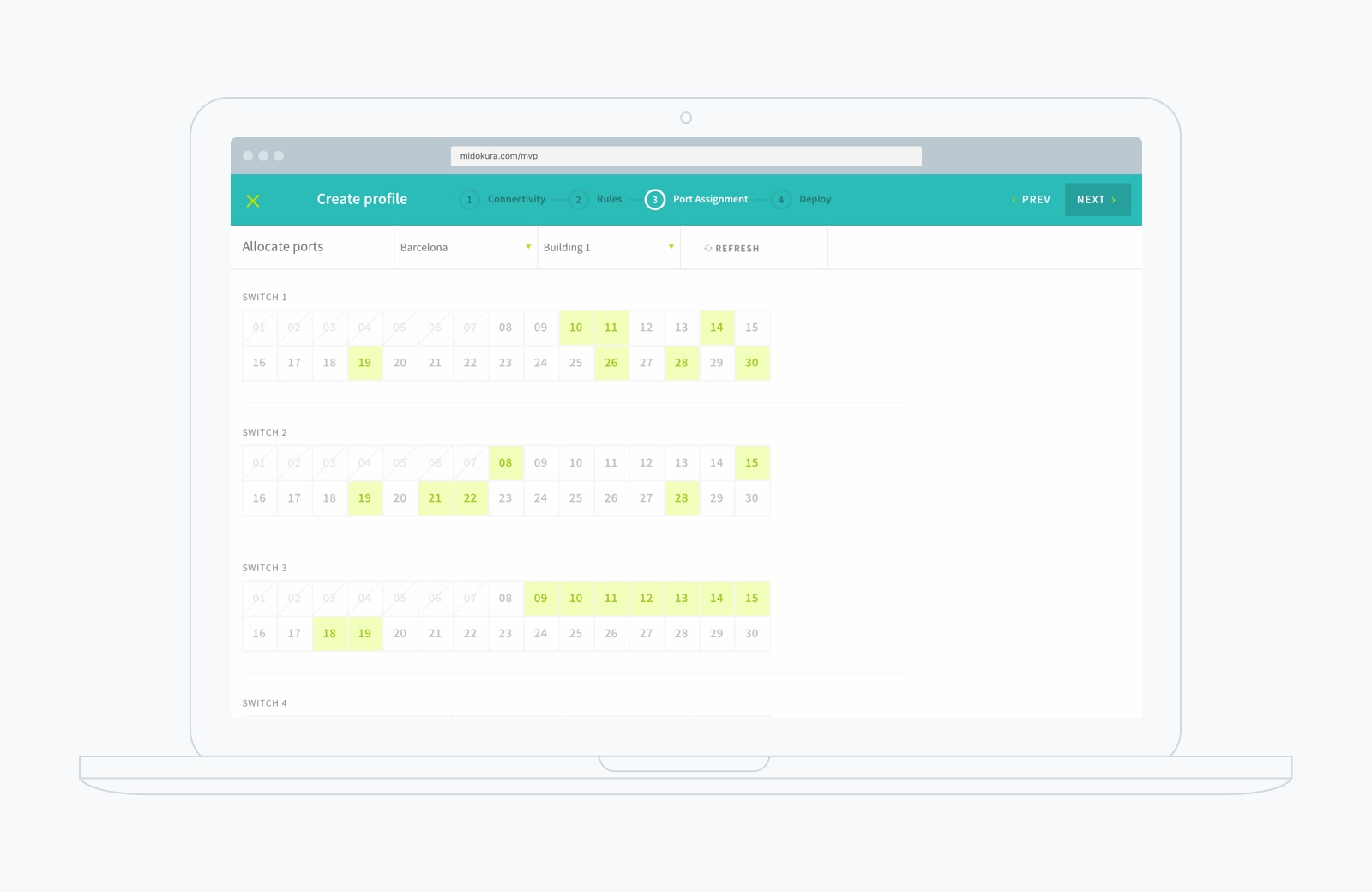
After Midokura picked their most promising idea, we were to make it a prototype. It was an idea on a post-it note. Our Experience Design partner sat down with the IXD designer and CTO to discuss the goals for the dummy. Everyone started to draw and visualise their thinking.
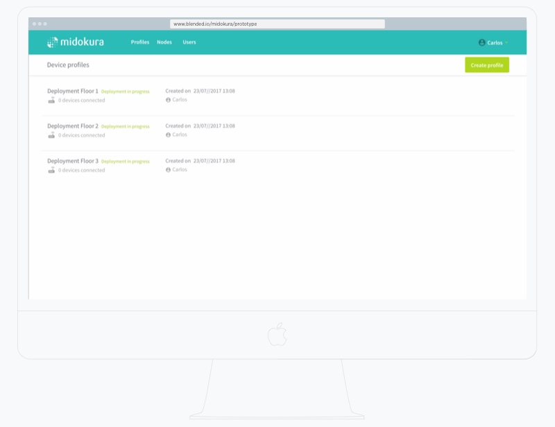
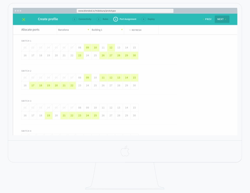
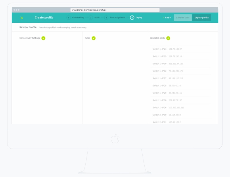
Over the course of the next few days, the flows and UI details started to appear. We used online collaboration tools to get hand-on feedback from the technical team at Midokura.
The design team established the flows and the navigation pattern in a matter of hours. As it turned out, the challenges circulated around the technical requirements (due to dependencies in many steps). The project team decided to not pursue every technical detail to improve speed and implementation. blended.io design engineer began to translate the wireframes into code when we defined the nav model. We were able to move fast between paper drawings, Sketch and code because our designer has a good mix of skills.
The speed of implementation really depends on the process that one choses. If you as a client would like to be able to step in to direct and guide, the speed is lower. The state of the interaction and visual design at a single point in time is not that important because the state is in constant change.
If you trust your partner and rather take a step back, the speed and therefore turnaround is much higher. For this project we have chosen to have our design engineer take care of the implementation as his skills at design and code are well balanced. blended.io was able to define interactions and visual style very quickly that more than matched the expectation of our client.
As the interaction and visual design was well defined, the design engineer could work his magic without doing many exchanges between blended.io and our client. blended.io completed the prototype within three days and then shipped it to the client via GitHub Pages.
Get hands-on articles about innovation, UX design or engineering!
Want to come up with a new digital product, expand your existing business, stay competitive? What's your next step?
Get in touch with Andree Huk
at +49 30 5557 7174 or [email protected].