What the client says
-
We are really happy with the experience design and front-end implementation. The new dashboard has been launched to our client base and so far we have received very good feedback.
Christian Ulitzka, Chief Executive Officer @ unidesq.com
We have designed the B2B front-end that Unidesq customers use to manage their accounts and campaigns from scratch.
The starting point
The founders, James and Christian, came to us to redesign and rebuild the front-end for their performance-based marketing solution. They articulated clearly early on that they wanted their marketing offering to set a clear signal in their respective B2B market in terms of overall user experience, front-end performance and great visual design. They had some sort of simplified front-end at the time we set out to redesign the experience from scratch. That front-end was based on Bootstrap built around a reduced feature set which we had to extend and further build out.
![Unidesq.com, Interaktionsdesign und Visual Design, User Research]()
From an experience design perspective, the target market was clearly defined as our client already had their own clients using the product. Luckily, they had addressed a certain niche in the market for their early product, so we were able to rely to a large extent on the feedback from those initial clients as they were fairly similar in terms of their needs and goals for the new UI.
We based our initial drafts and UI concepts on competitive analysis as well as early client feedback in order to "locate" the product angle and potential edge that would set the Unidesq experience apart from the competition. Independently from Christian and James, we came to the conclusion that performance, focused and reduced interaction flows as well as an astounding visual design would create a leading proposition in the marketplace.
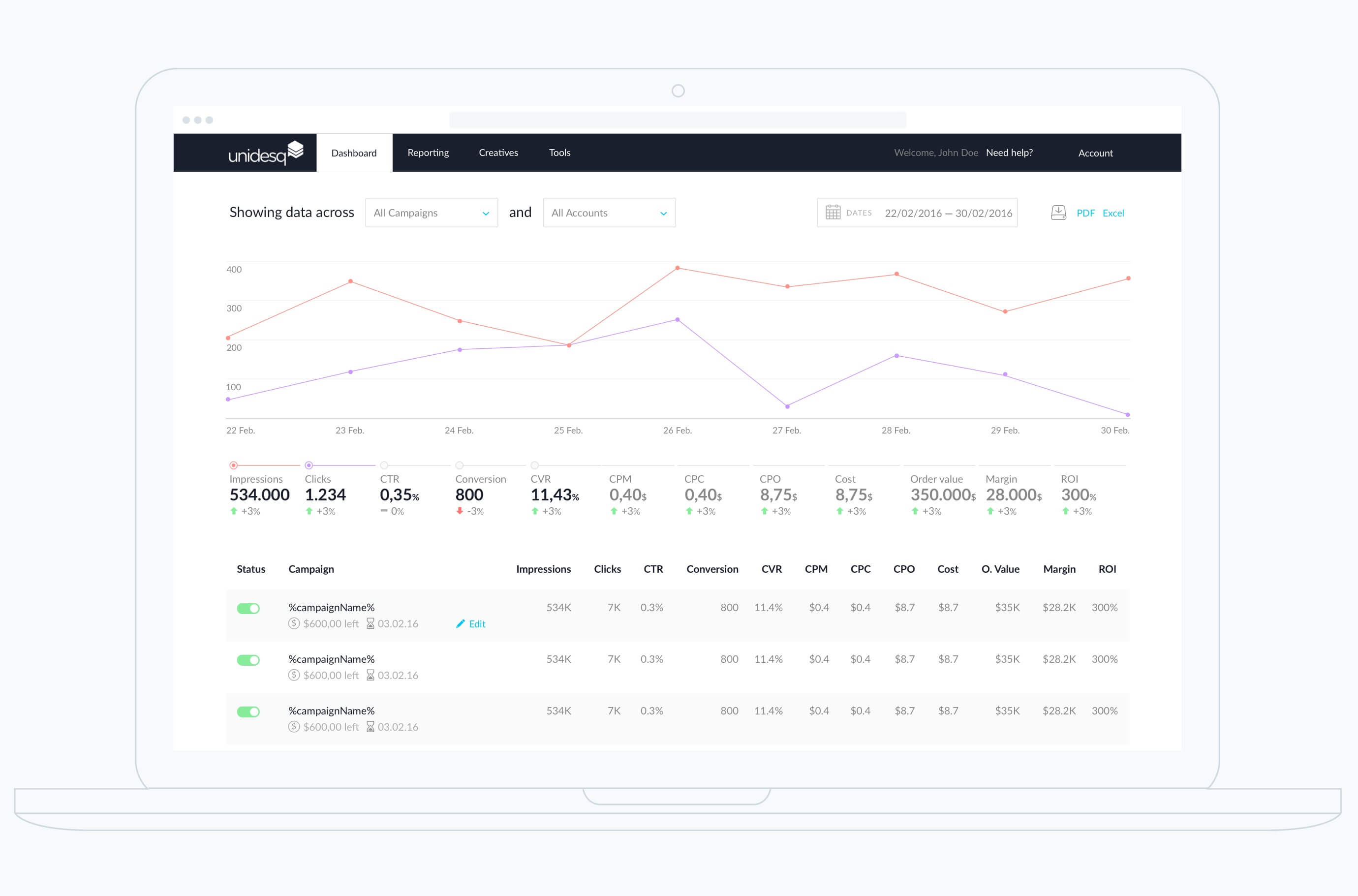
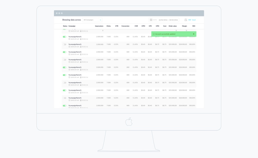
Dashboard for campaign management
![Unidesq.com, Interaktionsdesign und Visual Design, User Research]()
![Unidesq.com, Interaktionsdesign und Visual Design, User Research]()
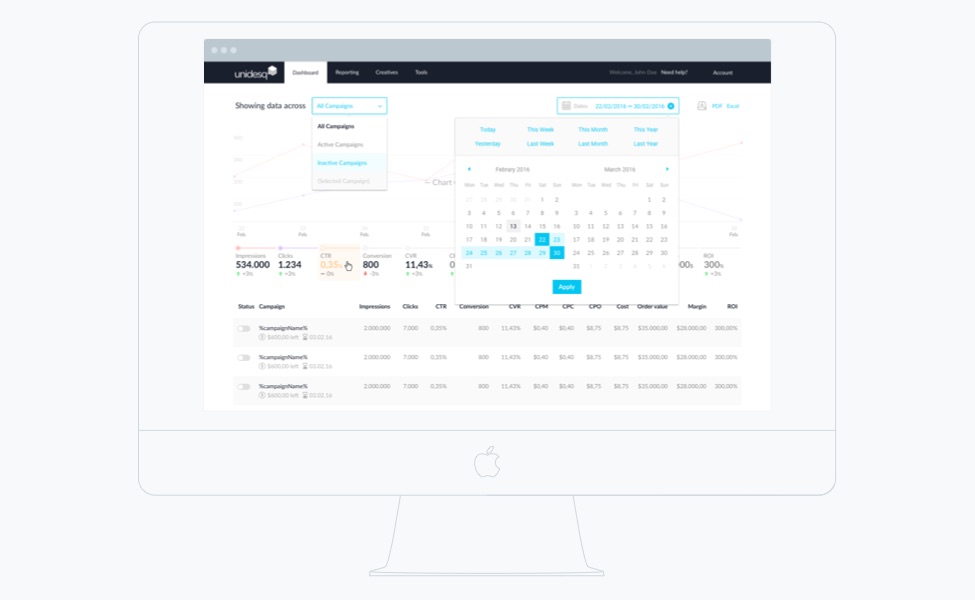
The datepicker, campaign & kpi selector
![Unidesq.com, Interaktionsdesign und Visual Design, User Research]()
Design for graph interaction
Practice usually trumps theory. Together with the client, we defined five KPIs which the graph would be able to show in more detail per chosen timeframe. Now, as a graph can only show two scales at a time, one left and one right, we had to design an interaction flow that would allow the user to switch between KPIs to view their respective scales. Although the ChartJS library does allow to show two scales at the same time, the possibilities for interaction with the graph are fairly limited. We decided that the chart would only show one scale at a time. The user can select and switch between KPIs that will immediately be shown in the chart (5 max. at a time).
So how would the user be able to show the scale for each respective graph? ChartJS shows a circle on each section on the line of a graph. Although we had initially defined that the user would be able to click anywhere on a graph to make interaction much easier, ChartJS only allows the circles to be clicked. Therefore, in order to make the scale change for a respective graph or KPI, a user will need to click a single circle.
We have to say that we deeply appreciated the dedication to detail that the founding team possessed and are very grateful to have been able to work with them on such a cool product.
Detail for the datepicker, campaign & kpi selector
![Unidesq.com, Interaktionsdesign und Visual Design, User Research]()
![Unidesq.com, Interaktionsdesign und Visual Design, User Research]()
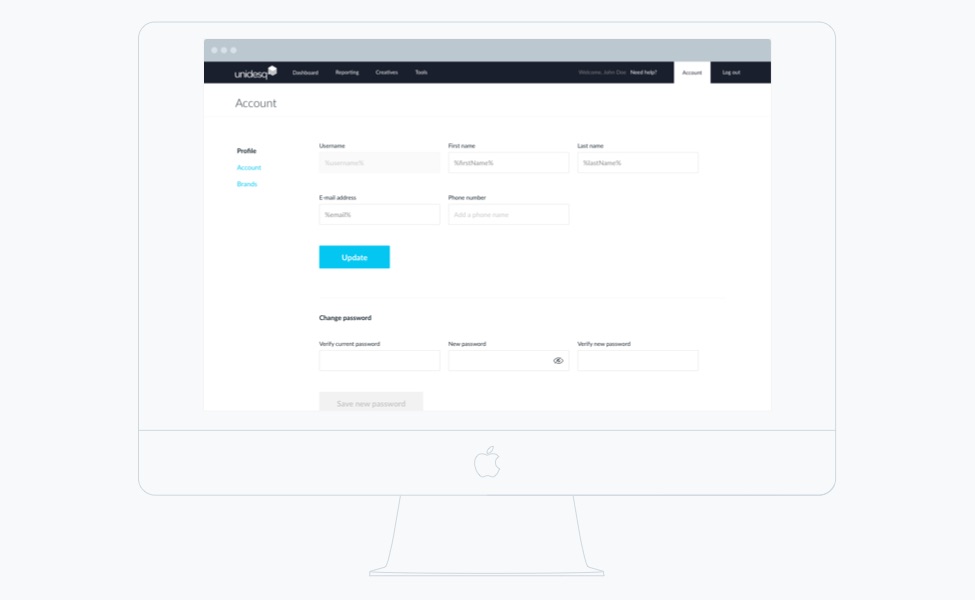
The account and profile screen
![Unidesq.com, Interaktionsdesign und Visual Design, User Research]()
Stay on the edge
Get hands-on articles about innovation, UX design or engineering!
